Like any good nerd, I jumped on the Windows 8 download as soon as I could from The Windows Developer Page. I downloaded the 4.8 gig, 64 bit, full developer tool version (insert Tim Allen-style grunting here) and it took about 2 hours to arrive.
Once I had the .iso, I tried to install it in VMware on my MacBook Pro, but VMware kept complaining about some stupid error or another when it was trying to boot from the .iso, so I decided to move on. I fired up Virtual Box and this time got no complaints. The install was pretty quick and painless and took “maybe” a half hour, I didn’t time it. I created the virtual machine with 2 processors and 2 gigs of RAM and plenty of hard disk space.
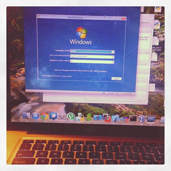
My “artsy” install screen.
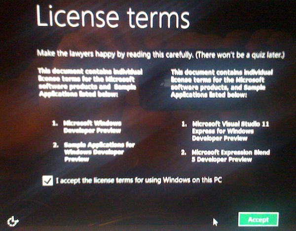
I also had to accept a license (it seems pretty lax):
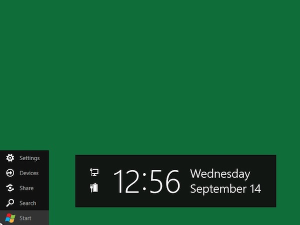
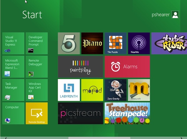
Once I got all situated and into the OS, I was presented with a kind of confusing “totally green” screen. I was moving my mouse around and when I got to the “Start Button Corner”, some things popped up on the screen.
When I clicked “Start”, I got my first big time look at the new Metro UI.
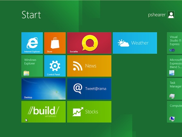
If I scroll to the right a little, there is more.
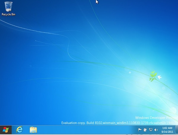
But don’t worry, though, if too much change isn’t your thing. If you click “Desktop”, you get to see “Old Faithful”.
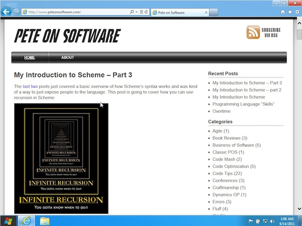
My first order of business – of course – was to check and make sure my blog was still okay. I mean, a man has to have priorities.
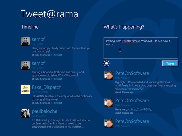
This version came with a Twitter client called Tweet@rama. It definitely is built in the Metro UI style that those of us with Windows Phone 7s are used to. It seems to have a panorama view and familiar styling on all of the icons and buttons.
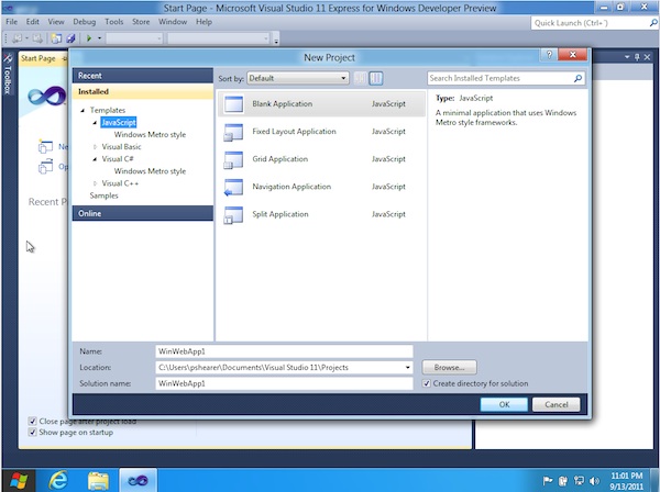
Of course, you can run Visual Studio on it, but OH NOES… JavaScript!?!? Calm down, people, C# is still on here too… 🙂
All in all, Windows 8 is a good-looking operating system. If you can get behind the Metro UI on the Windows Phone, you will be at home here. The tiles can be moved around and they dip and slide out of each other’s way as you are doing any housekeeping or clicking. Also, there are Live Tiles – like WP7 – that update with current information.
If I was using this on a touch device, I would call this a definite home run. The problem is that the side scrolling was a little clunky to me using a mouse. It could be a VM issue, but my scroll wheel on the mouse that normally lets me press and slide up-down-left-right on a page did not work, so I had to go down and grab and move the horizontal scrollbar. Those of us who develop for the web know that people really hate doing that.
It is possible that Microsoft is betting on a huge move to touch devices being front and center for most business users in the future. I’m sure there is a happy story for developers and people who do a lot of data entry, but after an hour of playing, I don’t know what it is yet 😉
Do you have it installed yet? What do you think?
 Kind of mentioned it above, but BASIC on my Commodore 64. In fact, my first book on programming was called “I Speak BASIC to my Commodore 64”.